Charts and timeframes
Reading the market: How to understand charts like a pro
Where will the price go — up, down or sideways? That’s what technical analysis helps you figure out! By studying charts, you can predict future price movements based on past data.
Why does it matter? Markets tend to follow patterns. If you learn to spot these patterns, you’ll have a huge advantage in trading!
Let’s start with the basics: price charts.
Charts and timeframes
Types of charts: Pick the right one for you
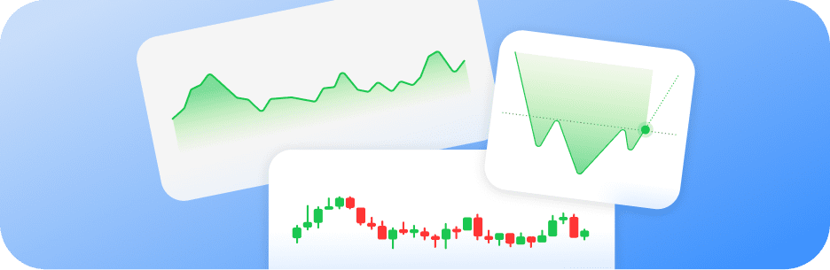
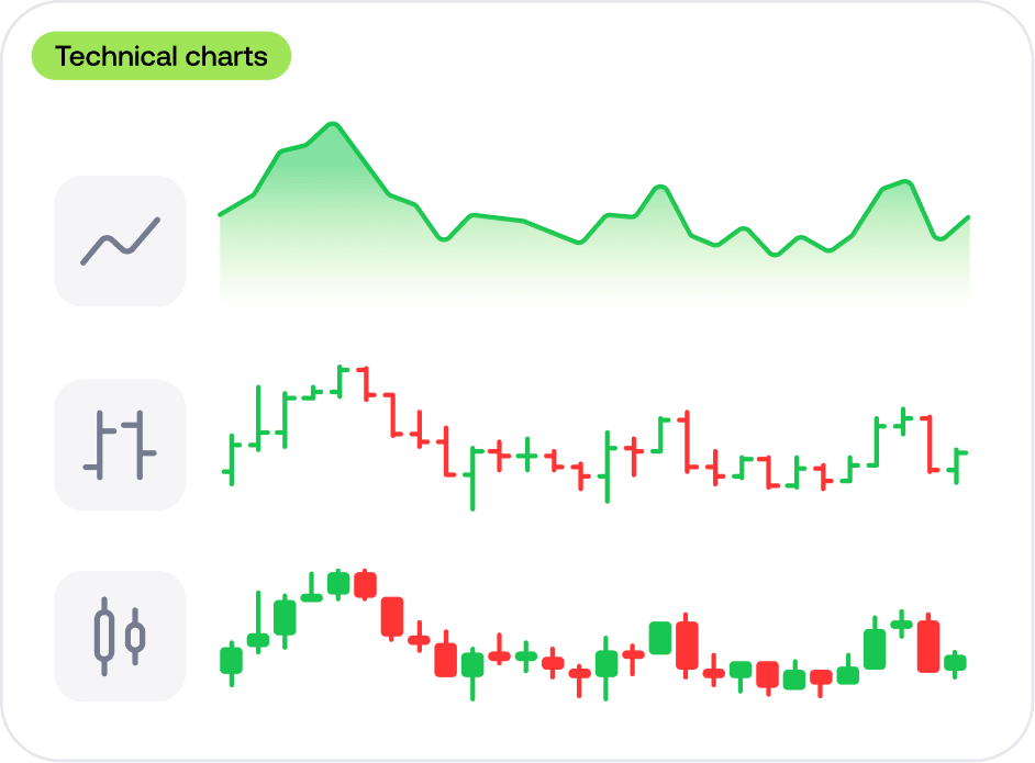
A trading chart is like the heartbeat of the market — it shows how the price moves over time. There are three main chart types.
- Line chart. Simple and clean, this chart connects closing prices to show the overall trend. Perfect for a quick overview
- Bar chart. Shows open, close, high and low prices in each bar. Great for spotting ups and downs
- Candlestick chart. The most popular one! Each candle shows price movement with colors — green for up, red for down. Ideal for spotting patterns
Let’s take a closer look at candlesticks since they’re key to understanding market moves.
Charts and timeframes
Understanding candlesticks
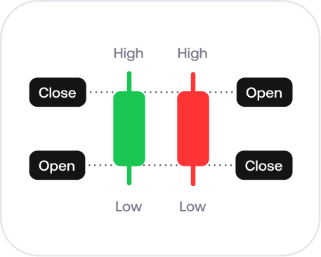
Each candlestick represents a price change within a specific timeframe — it could be 1 minute, 1 hour or even a whole day.
🟢 Green candle: Price went up (closed higher than opened)
🔴 Red candle: Price went down (closed lower than opened)
🕯️ Wicks (thin lines on top/bottom): The highest and lowest prices reached in the timeframe.
Once you get comfortable with candlesticks, you can start spotting patterns that repeat over time!
Charts and timeframes
What is a timeframe?
Timeframes let you zoom in and out of a price chart. They show price movements over specific periods, from minutes to months.
🔍 Want to see small price changes? Zoom in to shorter timeframes.
🔍 Want to get the bigger picture? Zoom out to see longer trends.
It’s all about how closely you want to follow the market. Let’s help you choose the best fit.
Charts and timeframes
Which timeframe to choose
It’s all about finding your own style. Here’s the lowdown:
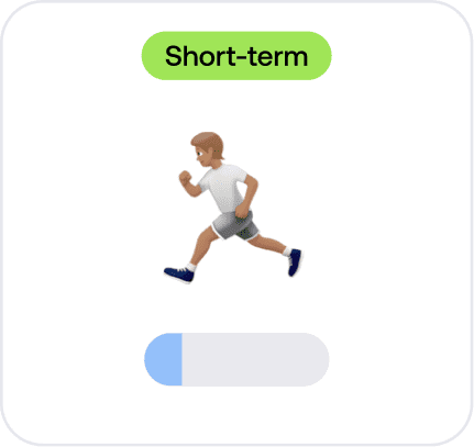
- Short-term trading (1, 5, 15, 30 min). Best for active traders who like fast-paced action and multiple open trades per day
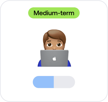
- Medium-term trading (1 hour, 4 hours, 1 day). Great for traders who check in a few times a day and hold trades longer
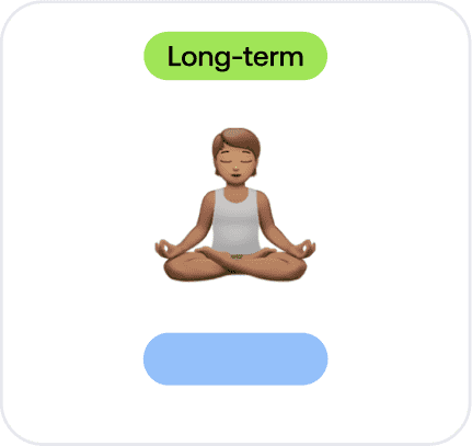
- Long-term trading (1 week, 1 month). Perfect for those who prefer slow and steady strategies, holding trades for days or weeks
📌 Pro tip: Lots of traders combine multiple timeframes — they check a longer timeframe to spot the trend, then use a shorter one to fine-tune their entry point!
Charts and timeframes
Ever wanted a crystal ball for trading?
🔮 Good news: You kinda have one! Chart patterns act like a guide, helping you forecast market moves.
A chart pattern is a formation on a price chart that repeats itself, indicating where the price may go. Recognizing these patterns gives you an edge by being able to more accurately forecast price changes.
Let’s explore the chart patterns every trader should know.
Charts and timeframes
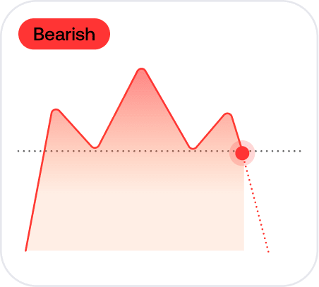
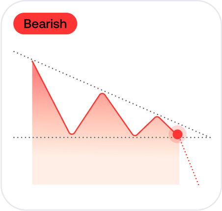
Head and shoulders
👤 What it looks like: A high peak (the “head”) with two smaller peaks (the “shoulders”) on either side.
What it means: Prices might stop rising and start falling, usually indicating the beginning of a downtrend.
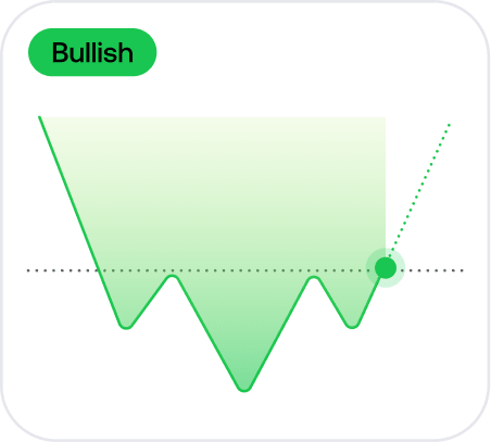
Inverse head and shoulders
👤 What it looks like: An upside-down head and shoulders pattern, with a low valley (the “head”) and two higher valleys (the “shoulders”).
What it means: Prices might stop falling and start rising, usually indicating the beginning of an uptrend.
Charts and timeframes
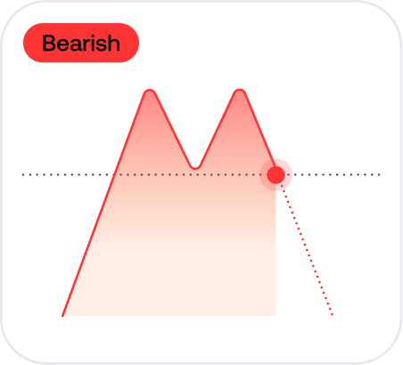
Double top
What it looks like: Two peaks that look like twin mountains forming an “M” shape.
📉 What it means: After hitting the top twice, prices might start to fall, usually suggesting a potential downward move.
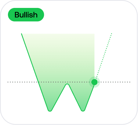
Double bottom
🏞 What it looks like: Two valleys that form a “W” shape.
What it means: After hitting the bottom twice, prices might start to rise, usually suggesting a potential upward move.
Charts and timeframes
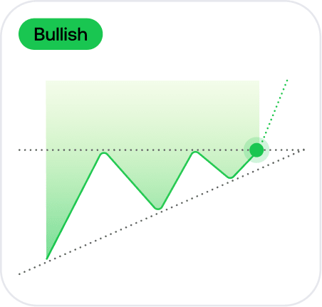
Ascending triangle
🔺 What to look for: A triangle shape with a flat top and rising bottom.
What it means: Prices might break upwards, continuing an uptrend.
Descending triangle
🔻 What to look for: A triangle with a flat bottom and falling top.
What it means: Prices might break downwards, continuing a downtrend.
Charts and timeframes
Quick quiz: Test your knowledge
What does a red candlestick mean?
Charts and timeframes
Summing up
Congrats! Here’s what you’ve learned:
- The three main chart types (line, bar, candlestick)
- How to read candlesticks and spot market moves
- What timeframes are and how to choose the right one
In the next lesson, we’ll dive deeper into trends and how to use them to your advantage. Let’s keep going!